Freelance Web Blog
The work, snippets, thoughts, ideas & opinions of a freelance web designer.

Recent Posts
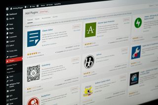
Why I Don't Use Wordpress
I don't use WordPress. Instead, I build faster, simpler, more reliable websites with Jamstack tools like 11ty, Pages CMS and Netlify — and here's why.
#1
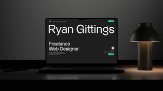
Introducing the New Site for 2025
After months of refining, rethinking, and rebuilding, I’m excited to introduce the new iteration of my site for 2025—a platform that reflects not only the work I do, but how I think and build.
#2
Website Design & Development Sample Brief
Creating a strong project brief is one of the most valuable steps you can take to ensure your web design or development project runs smoothly.
#3

Front-End Development in 2025
I wanted to create a post to explain a little bit about my approach to front-end website design and development in 2025.
#4
Older Posts
-
A Big 2018 #17
-
Why SEO? #18
-
What is SEO? #20